Why you shouldn’t use Word to do Graphic Design
Creating documents is central to every role I’ve ever had as a Digital Communications Professional. Colleagues also want something they can edit. It has to be in Word – they insist. Understandable. But they also want pages and pages of elaborate text, with images and graphics and borders.
I, the Communications Professional, try. I put it together. It is fiddly and not easy. I pass it to Colleague. Colleague passes it back. The images have slipped, the page numbers don’t add up, there’s a rogue page and the text has broken!
Nightmare!
The cycle repeats as the colleagues edit the document one by one. There’s a reason for this – Word was not conceived to do this job. It is not graphic design software.
You can be forgiven for thinking that Word can create brochures and booklets and other fancy documents. Word has become more intuitive in recent years. It is easier to save images in a document as images (right-click and save) than it used to be. It has more visual options. When you open it there are templates suggested for you to use.
I’ll let you in on a little secret – these pre-configured templates were hardcoded in XML (a coding language, a bit like HTML but for print). You will tear your hair out trying to get the same result from scratch in Word – or keep passing it back to your Digital Marketer.
What about PowerPoint?
Like Word, PowerPoint can produce some cool effects. You can also animate and there is flexibility to move images and text or create images by building up smaller shapes. But again, PowerPoint is not graphic design software, it was not created to allow users to make elaborate graphics (although the ability to save as different file types has improved).
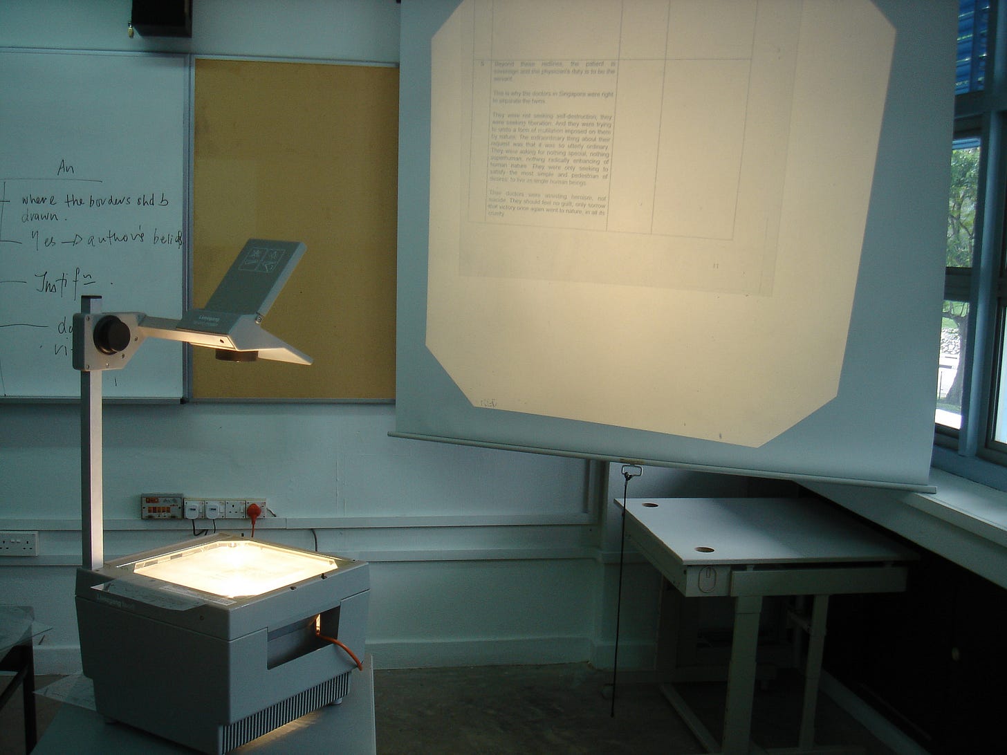
PowerPoint was created to replace the overhead projector. Remember, that clunky lightbox that used to be a mainstay of school assemblies and business meetings? Word likewise was created off the back of the typewriter. Have a look at the image below, you might see these programmes a little differently.
What should be used for larger, fancier documents?
Adobe leads the way with its very established InDesign being the industry standard – top magazines are produced using this programme, and I used it back in my Monarch days to create the Cosmos and Monarch Holiday brochures. I haven’t found anything that is quite the same and also free (comment below if you have!), although market-leader Canva isn’t far behind.
Once you get used to this software, you won’t want to create aesthetically pleasing documents with Word or PowerPoint again. InDesign has smart guides to help you place images and text precisely and line elements up easily. PowerPoint by comparison is clunky and not easy to line up – the boxes that hold text also contain excess space which makes compositions difficult. Images can also be easily resized so that they are not skewed, and every detail can be precisely customised.
To further enhance and create images, it’s rare to have Adobe on your computer without its siblings Photoshop and Illustrator (it is cheaper to have the entire package). If you don’t have Adobe, our friend Canva can also handle images as can the open-source programme Gimp, Photoshop’s free cousin.
Disclaimer: This is not a paid promotion; I am simply discussing the differences between the different software that I use day-to-day as a Digital Communications Professional.
Image credits: Daria Kraplak (typewriter) and mailer_diablo (projector) and Theme Photos (graphic design title image)


